Coffee Packaging Design Guide – 8 Tips To Design The Best Coffee Packaging
Packaging design is a good promotional medium for products, which can most intuitively disseminate information and establish communication with consumers. For coffee products, an excellent packaging design can well convey the value and efficacy of coffee, and convey the concept of its brand. Beautiful coffee packaging design can attract public attention, and a clear layout can better enable consumers to understand the information they want. Today, we’re going to show you the best way to design coffee packaging.
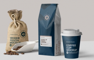
How To Determine A Good Coffee Packaging?
1. Practical coffee packaging
The greatest coffee packaging is not only physically pleasing, but also useful.
Proper packaging can safeguard your coffee, whether it’s ground, flavored, or coffee beans. While picking packing materials and styles, it is vital to consider the safety of the product during transit and storage as a reference.
Whether you use the most sophisticated technologies or classic materials, effective packaging can keep your coffee fresh and protected from the time the product is created.
2. Packaging promotes your brand
Package design and details may strengthen your brand and your coffee.
While creating packaging, you may choose to position the brand in the front and center of the design, or you can use a more discreet spot. Emphasize the most fascinating parts of your company’s packaging, such as where the beans are sourced, any environmental initiatives done by your business, and unusual tastes.
Utilize your packaging to promote the value and narrative of your brand – people will be drawn to your product, they will identify your brand, and they will be more willing to purchase your coffee in the future.
3. Package design will promote your product
Excellent packaging makes your coffee distinctive. It may capture clients’ attention and lure them to your goods, not to compete.
While we are prepared to think that we do not evaluate individuals by their looks, most of our judgments about a product are based on its design. The study demonstrates that before individuals consciously make a choice, they unconsciously make a decision within seven seconds. It just takes a few minutes for customers to determine if they want to use your goods, and packaging plays a vital part in deciding.
At retail outlets, the packaging of coffee is the initial impression. While creating your brand, it is vital to generate a great first impression – although your packaging may not alter the quality of your coffee, most buyers are driven by aesthetics. If people are not explicitly seeking your coffee, they are likely to select the most aesthetically pleasing or fascinating brand.
Excellent coffee packaging can assure the safety of your product, promote your brand, and attract new consumers – this is one of the most potent weapons for advertising coffee to new customers.
4. Convey your company message with creative coffee packaging
In addition to the visual and practical appeal, innovative packaging communicates the tale of your company and your coffee. When customers buy coffee, they frequently do not have an expert coffee manufacturer to aid them in comprehending diverse tastes and baking properties. Instead, the packaging of coffee must let buyers know all they need to know – not just the product, but also the value of the brand.
Where does the coffee originate from
Customers prefer to invest in things with stories. By putting human qualities into your packaging, your product stands out.
For example, you may put on the box the origin of the coffee beans, such as Ethiopia’s combined floral scent or Colombia’s vanilla coffee. If you work on a small, fair-trade coffee plantation, offer information about growers and their purpose. This helps your business appear more than simply a coffee manufacturer – placing tales about individuals on your packaging gives the notion that your firm is interested in people and quality, not just money.
As society progresses towards a more ecologically friendly and sustainable path, customers are likewise conscious of the influence of goods on the environment.
How to Best Enjoy Coffee
Help your clients comprehend the distinctions between each mix by adding informative writing to your packaging and outlining the unique tastes contained in each bag.
Your design has to be innovative. Instead of explaining the best method to prepare a cup of coffee, you may utilize clean images such as a tablespoon and water droplets. Straightforward, basic images may communicate the required information without producing visual confusion on the box.
What points may coffee container design start from?
The correct packaging is vital for developing a profitable coffee company. When you start developing your logo and label, the most crucial component is to come up with something unique to convey your business personality. Nevertheless, with shop shelves loaded with numerous firms and brands, coming up with an effective design might be daunting.
How To Design Coffee Packaging?
To help you get started, we have selected 8 top methods to make your coffee packaging stand out.
1. Accent color
The human eye is captivated by color. To make coffee packaging stand out from the competition, emphasize color in your design.
You may employ color psychology to produce an eye-catching label – green is generally connected with health and nature, while gold transmits characteristics of elegance and majesty. You may mix various colors in a colorful, lively pattern.
Nevertheless, you don’t have to utilize bright colors in your packaging to make your product stand out. Occasionally, simple colors and designs may be as stunning as vivid labels, indicating that your business is trendy, sophisticated, and current.
Try various alternative color patterns. To make your package distinctive, you might attempt odd hues such as spring green or pink. Instead, you may pick a gentle gray or brown hue. A great color scheme may stand out from the crowd and represent the message and tone of your business.
2. Create unique packaging
Make innovative and beautiful packaging.
According to a 2015 study, food and beverage brands that use motion and motion images on their labels perform better than companies that use static images. Customers tend to perceive that “mobile” labels are more interesting and new than other labels, which implies they are more likely to pick “mobile” packaging on shop shelves.
If you wish to add an image or picture to your package, you may visualize your coffee being poured into a waiting cup, or coffee beans spilt on your holding palm. Sports will generate a visceral experience for viewers, draw them to your goods, and drive them to read more.
3.The layout on your packaging determines its success.
Creativity and distinctive typefaces are one of the most significant design aspects in packaging and branding. For example, many prominent corporations solely utilize typefaces for their logos, which highlights the value of beautiful typography.
Keep the coffee packaging and brand messaging in sync with one another. If your company’s brand identity relies on simplified typefaces, be sure to have the same feel throughout all of your coffee packaging (although you may experiment with various font sizes and styles).
If your company’s identity relies on simple, modest typefaces, you can spice things up by using a strong, retro-style typeface on your coffee label. Yet, it’s important to exercise caution when using a variety of typefaces on the packaging, since doing so might result in labels that seem chaotic and unappealing.
4. Oral history
How your coffee and brand came to be packaged may be a narrative in and of itself. Don’t be hesitant to include descriptions when making tags that are both useful and appealing.
Think about the information that could pique the attention of your target audience. Your guide to the ideal cup of coffee should include details regarding the origin and preparation of your coffee. Provide a list of possible coffee tastes, such as chocolate or berry, for customers to expect.
Avoiding label clutter is essential for effective descriptive packaging; this may be accomplished via the use of text blocks and inventive typography to divide up huge blocks of text and stylised visuals to simplify information.
5. Show how valuable your brand is
Include any awards or certifications your firm has received on the package.
Even if your label hasn’t won any major accolades or certifications, you should still be proud of it. Promote a key brand value, such as a pesticide-free farming model or an open supply chain. Telling customers that your business is dedicated to producing only high-quality goods can go a long way toward earning their confidence.
6. Integrate images
Stunning visuals designed imaginatively are sure to get the attention of potential buyers.
The designs or pictures you use on the package should be given careful consideration. If your label is antiquated, uncomfortable, or badly made, most buyers will likely go for more aesthetically pleasing alternatives.
7. Brand voice
Think about the brand’s voice when you craft your packaging.
Your brand’s message will be communicated via the packaging’s design, color scheme, and overall aesthetic. The trick is to make sure that this message fits in with the rest of your brand’s narrative—do you want to convey an air of antiquity by talking about coffee’s roots, or do you prefer the hipster vibe of urban cafes?
Several aspects of your packaging, from color scheme to embellishments, should reflect the personality of your company. A vintage blue color scheme with traditional typefaces may evoke thoughts of the early 20th century, while a sophisticated and opulent business may benefit from a gold and black color plan. Packaging’s color may also be altered by the use of surface treatment materials; a matte finish conveys simplicity and modernity, while a glossy coating suggests complexity.
8. Traits that make up your brand
What people think of when they think of a certain business or product is comprised of more than just a name or logo. Soon, we will be able to identify a company by its logo, tagline, signature color, and even fragrance.
Branding your packaging is a crucial part of building a successful business. If you’re more concerned with where the coffee is located than with where the brand name appears, you may put your label wherever on the package you choose.
Keeping your coffee goods uniform in branding and placement can help customers become more acquainted with your brand and more easily locate specific products on shop shelves.
Top 10 Creative Cosmetic Packaging Design Ideas & illustrations 2023 | Luxury-Paper-Box.Com
10 Customs Of The Spring Festival (Lunar New Year) You Need To Know
Top 10 Best Lattafa Perfumes for Women & Men in 2024
Top 10 Best Packaging Design Software 2023 (Free & Paid)
Best Chocolate Packaging Designs of 2025
Natural Concept Perfume Design Ideas: Tell Your Brand Story


 kali@luxury-paper-box.com
