Top 10 Creative Cosmetic Packaging Design Ideas & illustrations 2023 | Luxury-Paper-Box.Com
For beauty lovers, the appearance of cosmetic packaging can sometimes be more important than the cosmetics themselves, and research has shown that if users are dissatisfied with the appearance of the cosmetic packaging box, they may not know more about the product. Obviously, in this oversaturated cosmetics industry, it is very wise to customize creative packaging boxes for products.
Here we share the 10 most innovative cosmetic and skincare packaging boxes to help you get inspired when customizing cosmetic packaging:
Top 10 – Modern minimalist skincare packaging
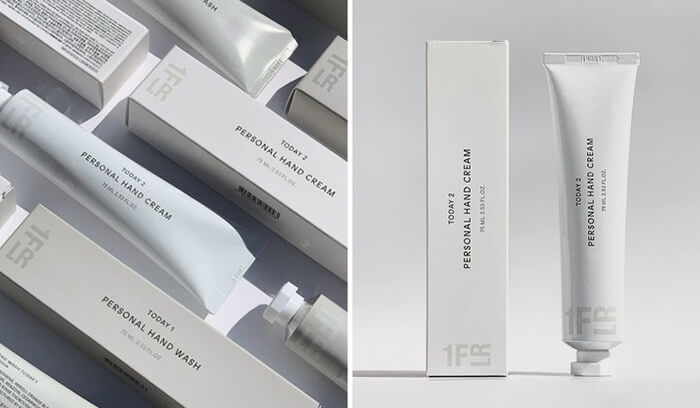
For some people, “less is more” is a very stylish and modern design concept. 1FLR is a premium cosmetics company that reduces overall product costs by simplifying packaging and distribution, and ultimately sells them at the most reasonable price. Their products include cleansers, toners, and moisturizers. To cater to urban minimalists, cosmetic packaging designers insist on a simple and clean palette of white, black, and gray, while the fonts are bold, sans-serif.
Top 9 – Elegant plant pattern creative cosmetic packaging
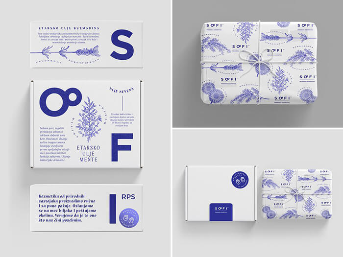
Based in Serbia, cosmetics brand SOFI specializes in the production of high-quality natural soaps, shower gels, lip balms, creams, body lotions, and much more handmade from natural ingredients. Its cosmetic packaging is divided into two types of packaging, inside and outside, the design style is very simple and generous, and the plant image is clearly printed in the packaging, which can effectively convey the “natural” characteristics of the product. The inner packaging is made of thin sheet paper and cotton rope, which is very retro. The outer packaging is selected from the aircraft box, which is different from the ordinary packaging, and the letters of the brand name on the outer packaging of the product are printed separately on the three sides of the packaging box, which is very distinctive.
Top 8 – Soft and stylish skincare packaging
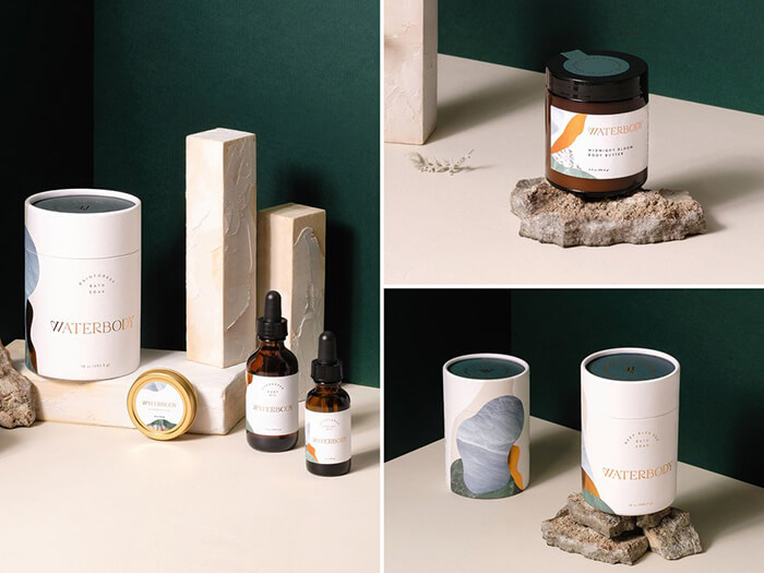
Waterbody is a skincare brand inspired by the wilderness of southeastern Alaska. The products are formulated using completely natural ingredients, including moss from the forest, wet musk and local lianas. Founder Angie wanted to convey this feature through branding and packaging, so designer Kati Forner chose a soft, natural and stylish cosmetic box color scheme that quickly reminds people of the earth, sea and sky.
Top 7 – Natural and elegant packaging of natural skin care products
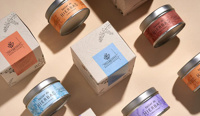
In nature, nothing is perfect, but it is beautiful. This is a very central emotion of Taller de Hierbas. Taller de Hierbas comes from El Retiro, a small town east of Antioquia, Colombia. Skincare products are mainly produced using herbs as well as different natural ingredients. With this in mind, their brand design uses a more natural and soft color scheme to show the natural ingredients contained in the product, while the single line logo resembles the slowly growing plants in nature, which is very much in line with the brand image of Taller de Hierbas.
Top 6 – Innovative packaging design for hygienic medicines
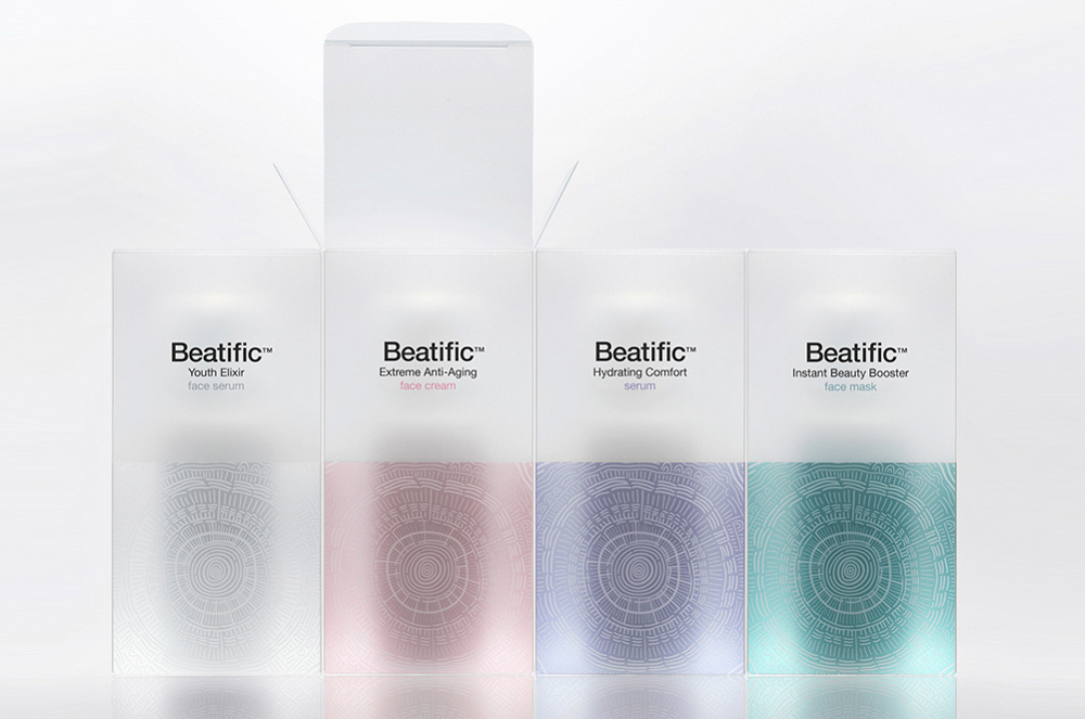
Beatific is a cosmeceutical brand from Greece, and the brand’s product packaging is made by Mousegraphics, a well-known Greek design team. The cosmeceutical product is mainly aimed at the high-end female market, and the product development is completely based on clinical medical research and positioned in high-end health care cosmetics. The Mousegraphics team combines the abstract sun pattern and the annual ring pattern as the creative visual symbol of the product packaging, symbolizing the two concepts of health and age, and presents four elegant colors in the translucent PVC material on the packaging material, making the overall packaging design both mysterious and high-end.
Top 5 – Creative abstract beauty high-end skin care series product packaging design
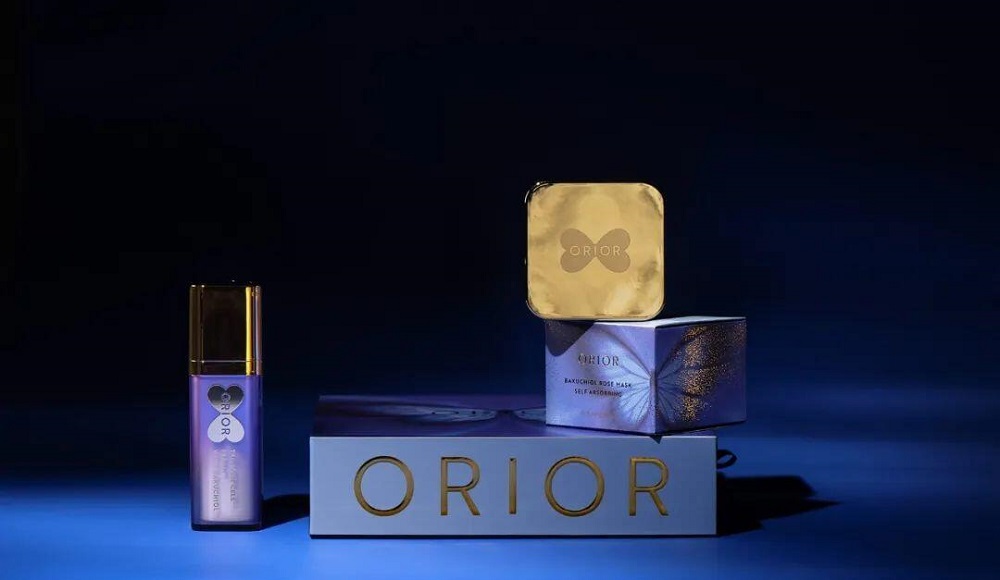
This skin care product packaging from Orior brand has a strong visual appeal and expression, the packaging design is clean and tidy without exception, and at the same time not detailed expression and creativity, butterfly as a packaging design has a clear visual super symbol, making the product both abstract and with a strong sense of art.
Top 4 – Creative illustration style cosmetic packaging design
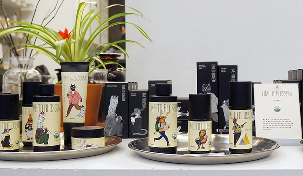
Time to blossom cosmetic packaging is designed by Korean design team Crosspoint Design Studio, the main audience of cosmetics is young fashion women, the civilian market pricing has obvious price advantages, the biggest feature of the product is pure natural plant essence extraction. The Crosspoint Design Studio design team created a set of anthropomorphic animal illustration images for the cosmetic packaging, using easy and free graffiti drawing to reflect the civilian characteristics of the product, and integrating humorous elements and different functions of the series into the relaxed and natural animal illustration image. This design has a certain story and topicality, forming a product packaging design system that is both integral and independent.
Top 3 – Creative cosmetic packaging design with unique style
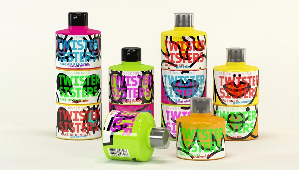
TWISTER SISTERS is a concept beauty brand from Russia, the brand’s packaging was designed by Russian designer Olkas Voron. TWISTER SISTERS’ beauty products include: facial cleansing gel, makeup remover, lip toner, etc., and the main consumer group is young and fashionable women. Olkas Voron uses highly decorative illustrations as the form of expression, using the facial expressions of young girls as the expression content, matching the bright colors preferred by young fashionable people, combined with the unique packaging shape of the product, so that the product can be sold independently or in combination.
Top 2 – Unique and simple creative cosmetic packaging design
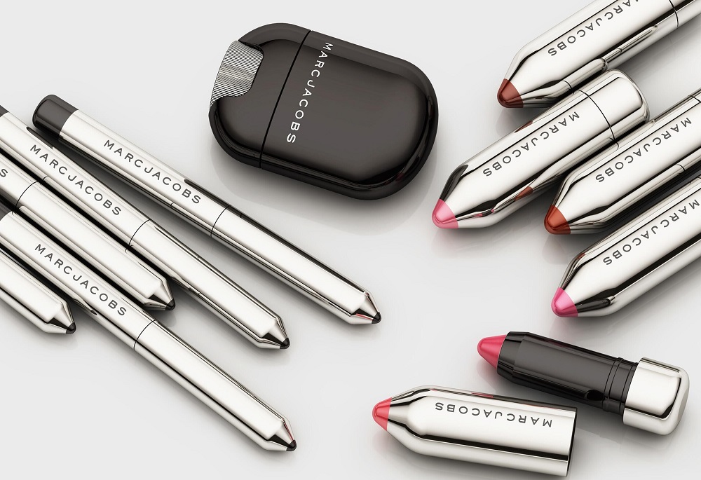
The packaging of this Marc Jacobs Beauty Line brand was designed by established NYC, a well-known American design team. Establishednyc design team focused on the external shape of the product packaging of lipstick and eyebrow pencil, and directly integrated the pencil shape into the packaging shape through the mimicry design method, which not only reflects the product function but also has strong visual recognition and differentiation compared with similar products, laying a good foundation for brand communication and product sales.
Top 1 – Fun and bold creative cosmetic packaging design
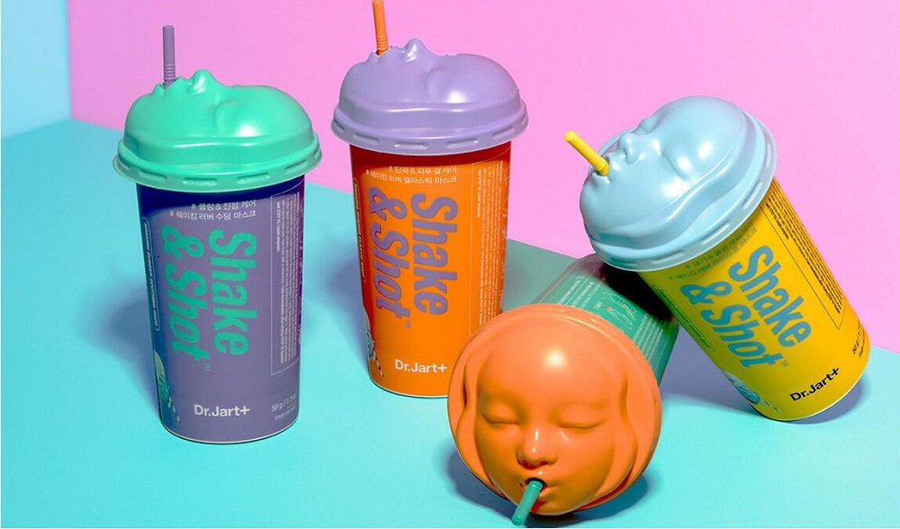
Dr. Jart+, a beauty brand from the United States, has launched a mask product aimed at the younger market and the packaging design is widely appreciated by the market for its bold and unique packaging. The uniqueness of Dr. Jart+ beauty mask is that its overall packaging design is cup-filled structure, which is significantly different from the traditional liquid mask packaging design, and the lid part has a delicate baby face shape, echoing the functional characteristics of its moisturizing, firming and tender baby-like care. At the same time, the product packaging is integrated with shovel blending and application tools, and the humanized structure design is convenient to access and apply the product. The unconventional creative techniques, unique shapes, and humanized structural design make the product have a great visual memory point, laying a good foundation for product sales and brand communication.
These creative cosmetic packaging boxes will obviously be unique and ingenious through their own brand image and concept to stand out from many products. Whether you’ve built a strong brand image or are in the process of building, don’t forget to keep your brand consistent with the box.
Top 10 Creative Cosmetic Packaging Design Ideas & illustrations 2023 | Luxury-Paper-Box.Com
10 Customs Of The Spring Festival (Lunar New Year) You Need To Know
Top 10 Best Lattafa Perfumes for Women & Men in 2024
Top 10 Best Packaging Design Software 2023 (Free & Paid)
Why Choose MDF Boxes Over Wooden Boxes?


 kali@luxury-paper-box.com

