Food Packaging Design Trend 2022 – Top 10 Best Food Packaging Design Ideas
Will the chocolate wrapped in a luxury chocolate gift box taste better? Will mineral water with a high-end design taste sweeter? No, it’s all a trick by the merchants to hook your wallet with higher-value packaging. Whether it’s the font, the shape, the material, or the color, any element of the package may determine whether a customer wants to take it off the shelf or not. Let’s take a look at these top 10 best food packaging design ideas 2022 shared on Luxurypaper.com, selected from food stores around the world, but with the common denominator of instantly capturing customers’ attention due to the unique creativity of their packaging.
Food Packaging Design Trend 2022 – Top 10 Best Food Packaging Design Ideas
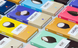
1. Loving Earth Chocolate Packaging
The keyword for Loving Earth chocolate packaging is simplicity, from the font to the design to the whole package. Two-color schemes are used as the base, the font is printed in the middle white part, and the cocoa beans either cut, peeled, or entire is printed on the top of the package, that’s all.
2. Pistachios Packaging
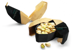
This looks like a good idea, inspired by the shape of pistachios, American designer Maija Rozenfelde simply shaped the outer packaging into giant pistachio, opening the box is like a peeling pistachio. This packaging also won the Red Dot Award in 2014.
3. Milk Packaging
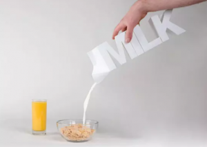
The easiest and most direct way to sell something is, to be honest, and this milk packaging does just that. Creative agency Visual Advice has directly made the milk carton in the shape of the letters “MILK”, which honestly looks a little hard to beat, but the idea is really amazing.
4. Buzz Honey Packaging
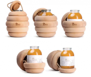
Backbone Studios’ design is truly mind-blowing, as they added a wooden ring to the glass bottle containing the honey, just like building blocks, to create a beehive-like feel.
5. Pasta Packaging
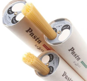
Unlike the four aforementioned food packages that are creative in appearance, this pasta package from Tamura Design Studio is more functional in design. The designer designed two round holes at the top of the package, the small hole for one person and the large hole for two people, making it easy for the consumer to take.
6. The DELI GARAGE Cheese Packaging
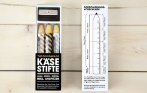
Please don’t mistake it for stationery. This cheese package by designer Korefe is made to look like a pencil. In addition, a pencil sharpener is also included, so that the cheese can be sharpened in the same way as a pencil, and the sharpener can be spun around to create a flower of cheese like pencil shavings, which is both convenient and creative.
7. The TEA EMPORIUM Tea Bag
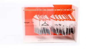
A cute and surprising tea bag. Designer Soon Mo Kang designed the teabags to look like hangers, and each teabag is hung on the hangers for fun.
8. Space Ball Chocolate Packaging Box
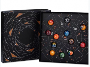
This sturdy and gorgeous 2-piece rigid chocolate cardboard box stands out with its unique space planet interior design and star pattern surface printing, perfect for packaging your fine chocolate snacks. At Kali, we design and print custom deluxe lids and bottom chocolate boxes to showcase your products and gifts in a beautifully unique way.
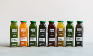
9. Green Press Detox Juice Packaging
The simple transparent glass bottle exposes the concrete form of the juice to show its green and healthy side. The green cap with white text is also visually refreshing.
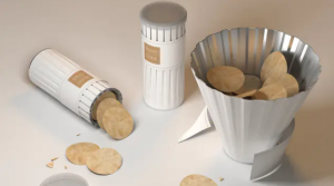
10. Bloom Chips potato chip packaging
You should all have had the experience of eating potato chips in a tube, right? It’s not a problem for one person to eat, but it’s a bit of a problem for multiple people to share. For this reason, Dohyuk Kwon, a young designer, has come up with this potato chip package. When you need to share, you just need to untie the band wrapped around the waist of the package, and the top half will come apart and turn into a paper plate, making it easy to share the chips with friends.
Top 10 Creative Cosmetic Packaging Design Ideas & illustrations 2023 | Luxury-Paper-Box.Com
10 Customs Of The Spring Festival (Lunar New Year) You Need To Know
Top 10 Best Lattafa Perfumes for Women & Men in 2024
Top 10 Best Packaging Design Software 2023 (Free & Paid)
Choose Your Best Eyeshadow Palette
Why Sustainable Packaging Matters for Luxury Electronics
Why Choose Soy Ink As The Printing Material For Packaging Boxes?
