How To Create A High-End & User-Friendly Label Design System?
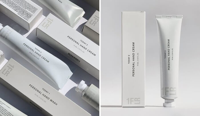
In today’s brand market, the competition is fierce. Generation Z and the sinking market show strong consumer demand, and a small number of new brands emerge suddenly. From going out of the circle to breaking the circle, more independent brands have won the favor of young people by emphasizing the consumer psychology of personality and being willing to pay for the lifestyle. Similarly, this is also reflected in the design of the brand itself. Nowadays, many brands are better at capturing the hearts of young people through detailed design methods. Label design, as a tool for shaping brand image, classification, or content, is a key word for brand tone. A beautiful label design will make customers feel high-end, high-quality, and user-friendly. Especially for independent design brands, here are some design tips on how to create user-friendly and beautiful label designs.

The Core of Label Design
Each brand or label will have its own label, which can be positioned based on the platform’s attributes and the psychology of the consumer group to create its own label system.
The first purpose of designing labels is to enable target consumers to quickly see key information and find relevant content about the product or brand. For example, clothing products may include product names, product item numbers, optional colors, ingredient information, etc.
Specification for Refined Label Design
Labels are visual symbols with symbolic meaning and connotation. With the development of society and changes in aesthetic trends, label design is also diverse and complex, but it has increasingly become an indispensable part of enterprise brand image construction.
Label design, just like brand design, requires a unified visual VI system to regulate the color, size, thickness, and bleed lines of the logo and text on the label. This is crucial for shaping the brand image. Once the color and font of the brand label are not unified, it will bring recognition difficulties to consumers, which will affect brand cognition and significant development.
How to Design Label Styles?
Utilize professional quality labels to make your product a focus of attention. Canva can be used as an online design tool to design labels for free.
On Canva, there are numerous label design templates available, providing you with hundreds of adjustable templates to choose from, helping you perfectly showcase your brand and products. Canva has a wide range of label designs, including wedding Dim sum to wine labels and price labels. You can also choose the desired custom size and design from scratch. With just a few clicks of the mouse, you can customize hundreds of designer-created templates and choose from millions of fonts, images, illustrations, and colors. You can also upload pictures and logos of your own brand and design tags that reflect your brand’s style. In addition to label design, Canva Paintable also provides you with a plethora of materials, including various free materials and illustrations.
Three Major Precautions for Product Label Design Images
In the process of graphic design, we often encounter the need to design images for product labels. For students who are currently unfamiliar with the product label design image process, we need to first understand the following three precautions.
Color
In the preparation process of product label design images, we first need to clarify the relationship between the product theme color and the label.
For example, the theme color of Pepsi is blue, so we should not overuse the red color represented by Coca Cola in the design process to avoid weakening the brand awareness.
Secondly, some brands’ main colors are not suitable for a combination of graphic and textual presentation, and it is inevitable to change the theme color during the design process. So, when choosing a new theme color, we must pay attention to avoiding direct/indirect/potential.
Composition
No matter what design, composition is an extremely important part. However, in the product label design images, we also need everyone to pay attention to the placement of specified information such as production information and inspection marks.
After all, depending on the product category, some public information must be placed in the designated area according to requirements. We must pay attention to the layout of relevant information in the composition of the ninth paragraph.
Font
Regarding fonts, simply put, making them understandable is the top priority.
In the theme slogan, we can appropriately use certain artistic fonts. However, in product introductions, ingredient lists, and security inspection information, we must unify the font size to make the entire text interface appear orderly.
Top 10 Creative Cosmetic Packaging Design Ideas & illustrations 2023 | Luxury-Paper-Box.Com
10 Customs Of The Spring Festival (Lunar New Year) You Need To Know
Top 10 Best Lattafa Perfumes for Women & Men in 2024
Top 10 Best Packaging Design Software 2023 (Free & Paid)

Best Chocolate Packaging Designs of 2025
Natural Concept Perfume Design Ideas: Tell Your Brand Story


 kali@luxury-paper-box.com
