Top 10 Best Type Settings And Compositions In Packaging Box Design 2021
With the continuous improvement of packaging box printing technology and the continuous renewal of printing materials, gift packaging box plays an important role in gift production and sales. In the design of packaging boxes, a good design idea is essential, among which digital composition is the most important. It involves the design and matching of pictures, words, and colors. At present, the composition of packaging boxes can be roughly divided into different categories. Next, we are going to show you the top 10 best type settings and compositions 2021 when it comes to design box packaging.
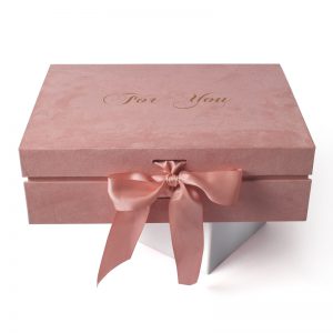
1. Independent main body type
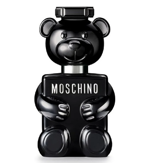
This design form is relatively common. A visual graphic is created according to the characteristics of product attributes. As the main body of packaging, we often center it and sometimes offset it. This composition is easy to create visual impact, simple and clear. For example, the following works:
2. Color block type
That is, use color blocks or pictures to divide the layout into two or more. Generally, some color blocks are used to display pictures (main visual part), and other color blocks are used to arrange product information. The slogan of this composition form is: fashion is the most fashionable.
3. Enclosed
Encirclement refers to the designer surrounding the main text information on the package with many picture elements in order to highlight it. This practice can make the product name or logo very prominent, which is a bit like the feeling that the man in the martial arts film is surrounded by the enemy.
4. Local type
The local style is to hide a part of the main figure and only show the part of the figure because many parts of the figure are better than the whole. This composition gives people a lot of imagination.
5. Text only
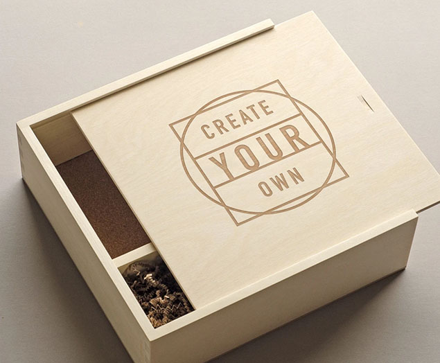
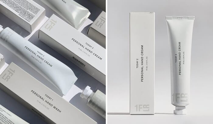
That is, the content of the design is all composed of the brand logo, product name, and selling points. Since there are no graphics, this design mainly tests the designer’s text typesetting skills. Many designers like this simple, high and cold design.
6. Shading
That is, the elements of the picture are designed into shading, which is full of the whole design layout and used as the background display. The packaging of many women’s products likes to use this design form like a custom perfume box, which is very beautiful and has full marks.
7. Sign body type
Taking the brand logo as the main visual core of the picture is the practice of many well-known brands. What they want is simplicity, atmosphere, highlighting the effect of the brand logo, and adding some technology to show high-end luxury.
8. Graphic combination
This kind of composition is more flexible. The main vision is not composed of an independent subject, but some scattered elements, text information, picture elements, etc. after the design arrangement, it will finally achieve coordination and unity. This form will test the designer’s design skills.
9. Integrated
That is, to combine the graphic information on the packaging with the packaging to achieve the effect of the integration of picture and form, and finally form a new thing.
10. Logotype
The logo style has its own retro and noble attributes, which are favored by many designers and customers. Many imported products like to use this form of expression in the empty eyeshadow palette packaging.
11. Full-screen
Full-screen design, that is, the picture part is almost full of the whole layout. This design is very full and complete. If you want to create an artistic conception, a full screen is a good choice.
12. Partially hollowed out
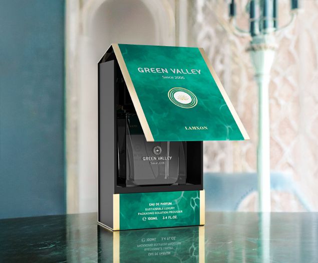
In order to let consumers see the products in the packaging box, some brands will hollow out a part of the packaging box. In this form, the hollowed-out part is the main body of the packaging. Therefore, whether the products inside the packaging and the hollowed-out shape are beautiful is very important. This form is used more for daily chemical products.
Top 10 Creative Cosmetic Packaging Design Ideas & illustrations 2023 | Luxury-Paper-Box.Com
10 Customs Of The Spring Festival (Lunar New Year) You Need To Know
Top 10 Best Lattafa Perfumes for Women & Men in 2024
Top 10 Best Packaging Design Software 2023 (Free & Paid)
Choose Your Best Eyeshadow Palette
Why Sustainable Packaging Matters for Luxury Electronics
Why Choose Soy Ink As The Printing Material For Packaging Boxes?
