Top 10 Creative Cookie Packaging Ideas 2023 | Best Biscuit Packaging Box Designs
When it comes to cookies, not only do they need to taste delightful, but they also deserve packaging that is equally delightful. Creative cookie packaging ideas can enhance the overall experience and make these delectable treats even more enticing. Whether you’re a home baker looking to add a personal touch or a bakery owner aiming to stand out on the shelves, this article presents the top 10 creative cookie packaging ideas that will leave a lasting impression on recipients. From charming DIY options to innovative professional designs, get ready to explore a world of cookie packaging inspiration that will delight both the eyes and taste buds. Let’s dive into the exciting realm of imaginative cookie packaging ideas and discover how they can add an extra touch of sweetness to every bite.
1 – Creative Pack Cookie Packaging
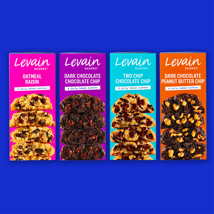
Creative Pack worked closely with Levain Bakery to design the CPG packaging box for this beloved cookie. The new design evokes recognition while inspiring a sense of discovery while also being prominent on the shelf behind the freezer door. Centered in bold Levain blue, the design is paired with delicious gooey stacks of their signature cookies, alluding to the pure commitment of the oven-baked Levain Bakery. A dotted line, a swirl of aromas, expresses the joy of creating and sharing through the Levain Bakery experience, while connecting the pile of cookies on the front panel, a new chapter for Levain Bakery, to the origin story on the back. A black and white photo of the founder in front of the original store summarizes Levain Bakery’s roots and shows that this product was born in an actual bakery.
2 – Neat Confections Cookie Wrappers
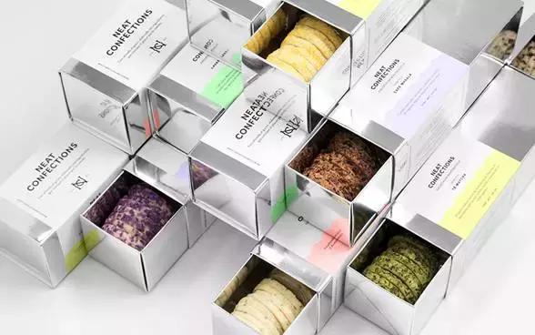
Neat Confections is a Mexican dessert shop. Their handmade cookies and pastries are made with a variety of organic spices and natural fruit flavors. Each pastry is baked and presented in the most perfect way. Perfection is the brand The most important feature, product quality is reflected in the purity of candy packaging design. Recently, they chose the packaging designed by Anagrama Studio. The silver-plated outer packaging can better highlight the characteristics of the candy itself, and the soft neon colors on the label add a warm and bright feeling.
3 – Bla-bla Cookie Wrappers
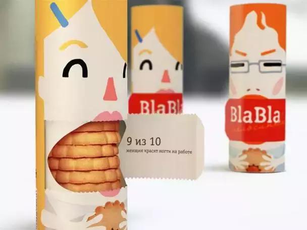
The core design of Bla-bla сookies packaging is three cartoon characters with abstract facial features: typical office workers, due to strict office rules and regulations, they cannot speak at work, but they can gossip about many things in blabla during break time , the interesting thing about this design is that instead of opening the package from both ends, it is torn from the blabla label in the middle, thus opening the mouths of the employees to reveal a mouthful of biscuits. The clever design of this packaging comes from Adeliia Koldarova, Oksana Paley, Daria Dahoo and Zaira Panaeva, four students of the British Higher School of Art and Design. The design inspiration comes from “If you want to stop gossiping people, give them some Things to eat.”
4 – Dillii Cookie Wrapper
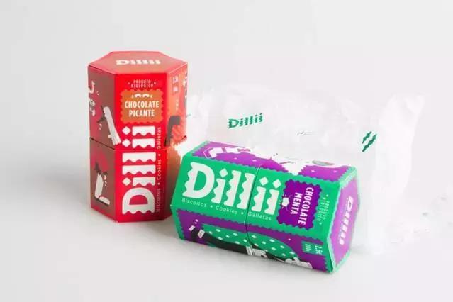
Dillii is a new biscuit brand full of fun and unique flavors that will perk up your downtime. “Dillirious & Dillicious” is a brand slogan that breaks through the limit of imagination. Opening the package of Dillii is like unlocking a crazy gift with ease. When it is opened, the original illustration will change into another combination, and at the same time display the brand slogan – two unique adjectives “Dillirious & Dillicious” defined by Dillii.
5 – Thelma’s Treats Cookies Takeaway Packaging
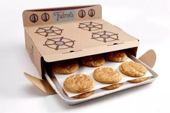
Thelma’s Treats, a cookie delivery company named after the owner’s great-grandmother, has rebranded its famous cinnamon cookie offering in honor of her 108th birthday. Manchester-based graphic designer Lucy Broderick has designed a creative biscuit packaging – Thelma’s Treats, which packs “love” into homemade biscuits. The new box is designed to reference an old-fashioned stovetop, and the biscuits slide out of the box as if freshly baked from the oven. While the design conveys a sense of nostalgia, the style still feels fresh, and it’s the perfect way to go from grandma’s kitchen to sharing a little love with the world.
6 – Cookielovers Cookie Packaging
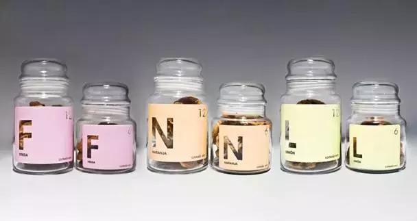
Cris Moreira is a creative graphic designer at Wired And Linked (grupo Visual), an agency in Galicia, Spain. Her design work can be summed up in four words: sensitivity, sophistication, visuality and color. She pays attention to each detail, with a passion for packaging design, web design, typography, illustration, social media and all things good thinking. The package designed for the ‘Cookielovers’ brand is her student work. The idea of the design is to integrate every taste with the elements of the periodic table, and use multiple colors to give people a lively visual stimulation.
7 – The Cuckie Fam handmade biscuit packaging
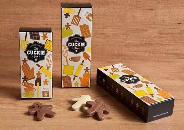
The Cuckie Fam is an artisanal family business that uses the best ingredients to create homemade food that everyone will love. This packaging design uses cute cartoon villains and a variety of bright colors to give people a lively and relaxed atmosphere. The patterns on it, such as gloves, rolling pins, egg beaters, etc., also highlight the characteristics of handmade. Mara Rodriguez is a graphic designer specialized in packaging design and creative director of Mara Rodríguez-Design – a creative design studio specialized in brand packaging design, which aims to be innovative, different and The unique style creates a new brand image for the enterprise.
8 – Erin Bakers Baking Packaging
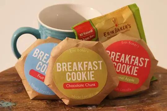
Based on Erin Bakers’ brand positioning that aims to bake with simple ingredients, Kate Sweeney uses environmentally friendly paper instead of plastic to reshape packaging, so that people’s day starts with a green and environmentally friendly breakfast. Kate Sweeney is a graphic designer at Krop Design, involved in graphic design, packaging, interactive design and other creative fields, and has designed App operation interface and website design many times.
9 – Chicken Biscuit Packaging
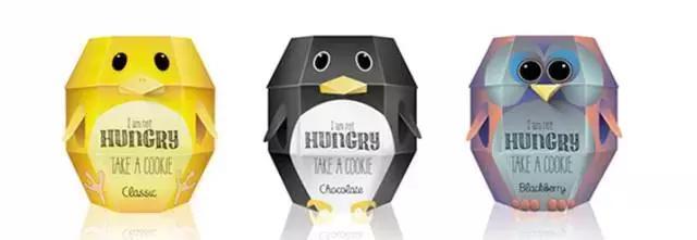
This packaging comes from Moscow-based designer Dasha Bazan, who defines cookies as “children’s lunch companion”. For this new definition, she uses chicks, penguins and owls as prototypes to design a unique octagonal appearance, thick cardboard To increase the texture, another ingenious thing is to eat biscuits by pulling out the mouths of small animals, breaking the tradition and adding fun.
10 – Blondie Cookie Packaging
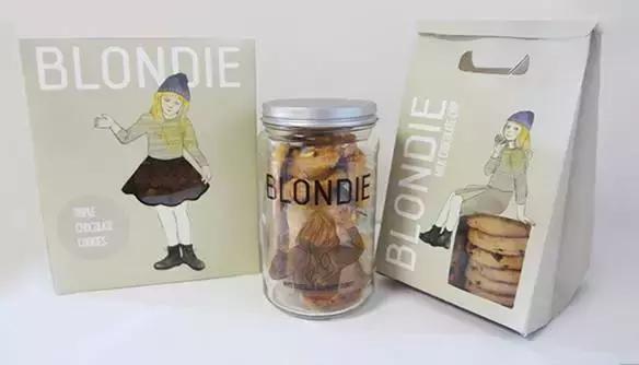
Andrea Granados is a junior graphic designer at Empire Design in New York, and this packaging is a completed mentor proposition project for her, which is to design illustrations for a set of cookies called “Blondie”, through fun creative methods, such as having a blonde girl sitting on a pile of cookies Climb on the window and look at the tempting biscuits inside, which adds vividness and attractiveness to the product itself.
Top 10 Creative Cosmetic Packaging Design Ideas & illustrations 2023 | Luxury-Paper-Box.Com

10 Customs Of The Spring Festival (Lunar New Year) You Need To Know
Top 10 Best Lattafa Perfumes for Women & Men in 2024
Top 10 Best Packaging Design Software 2023 (Free & Paid)
Best Chocolate Packaging Designs of 2025
Natural Concept Perfume Design Ideas: Tell Your Brand Story


 kali@luxury-paper-box.com
