Top 10 Tips for Designing Creative Stationery Packaging Boxes
There was a time when a stationery box was just a container and the label was only used to specify product details. As the market continues to change, companies responsible for product packaging design have taken on more responsibility. Now, stationery boxes and their labels have the important responsibility of attracting customers. They should act more like a salesman, attracting customers on their own merits and leading them to explore the product more deeply.
The design of stationery boxes and labels, then, ultimately falls on the shoulders of graphic designers. They need to put all their creativity into the design of stationery packaging. Every graphic designer is well aware of the importance of stationery box and label design. Therefore, they are always looking for tips and tricks to make their designs more attractive to their clients. Here are a few tips for designing creative label and stationery box designs that may be helpful to you.
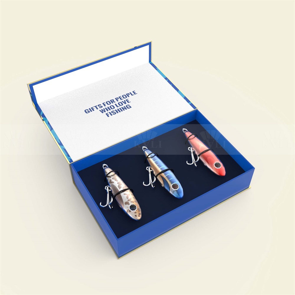
1 – Using packaging design to tell your brand story
Using the visual elements of your brand in your stationery box design is important, but there’s more to it than that. When designing a stationery box, what it ends up looking like on the shelf can tell consumers what your product is about.
2 – Position your audience
When designing the visual elements of your packaging, you should consider your target audience. For example, children’s stationery boxes often use large, bold typography and colorful styles, while products aimed at career-oriented adults can use more elegant typography in a smaller design.
3 – Communicate the idea
Packaging design should reflect the philosophy of your product. For example, eco-friendly products should be packaged with sustainable materials to help build trust in the product. If you are selling luxury goods, then you should use high-end materials rather than cheap packaging.
4 – Make stationery boxes more useful
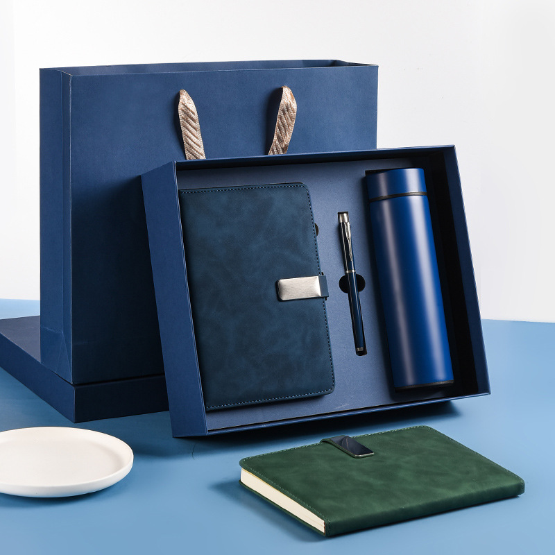
One effective strategy for making a stationery box stand out is by exceeding customer expectations. If the box has practical value even after the stationery inside has been used up, it can leave a lasting impression on the customer. By providing a functional and reusable box, the product becomes more memorable and may even inspire repeat purchases.
5 – Introduce limited edition packaging
While impulse shopping can be a negative habit for consumers, as a seller, it can be beneficial to encourage such behavior. In the stationery market, one effective way to promote impulse shopping is by introducing limited-edition packaging that aligns with current trends. By offering unique, trendy designs that are only available for a limited time, consumers may be more inclined to make a spontaneous purchase.
6 – Keep it simple
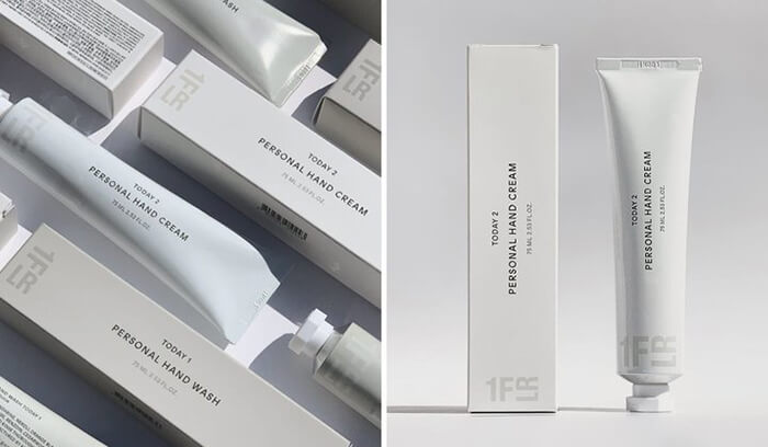
While creativity is a valuable asset in any creative endeavor, it is important to exercise caution and avoid going overboard. When it comes to designing stationery boxes and labels, simplicity is often key. This does not mean neglecting necessary information; rather, it means providing all relevant details on the packaging in a clear and concise manner. Avoid overly decorative or extravagant designs that may distract from the important information on the label.
7 – Meet market trends
In today’s age of social media, trends, and buzz-worthy phenomena can easily capture the attention of the masses. It is important to stay informed about these trends and integrate them into your packaging and labeling designs to drive sales of your products. By keeping up with the latest trends, consumers are more likely to be drawn to your products, leading to increased sales.
8 – Include some humor
There are no strict rules that prohibit the use of humor when interacting with customers. You need not limit yourself to straightforward product packaging and labeling. Injecting some humor into your stationery boxes, for instance, can foster a more amicable relationship with your customers. In fact, incorporating witty elements is likely to pique their interest and increase the likelihood of them purchasing your products.
9 – Compete with the product
Allow your packaging and labels to complement your products, as they are inherently interconnected. They work together like the body and soul, and need not be in competition with each other.
10 – Choose colors that can help the package stand out
Careful consideration should be given to the color of packaging as it is a crucial aspect of the overall design. The selected color should be vibrant and attention-grabbing enough to attract customers to the product on the shelves, while also being pleasing to the eye.
When customers enter the aisles of the supermarket, your product packaging should be clearly recognizable from other competing products. In addition, the label of the product should be clear enough that a person can know the name and brand of the product with just one glance.

Top 10 Creative Cosmetic Packaging Design Ideas & illustrations 2023 | Luxury-Paper-Box.Com

10 Customs Of The Spring Festival (Lunar New Year) You Need To Know

Top 10 Best Lattafa Perfumes for Women & Men in 2024
Top 10 Best Packaging Design Software 2023 (Free & Paid)

Best Chocolate Packaging Designs of 2025

Natural Concept Perfume Design Ideas: Tell Your Brand Story


 kali@luxury-paper-box.com
