Why Can Japanese Packaging Design Gain So Much Popularity In The World?
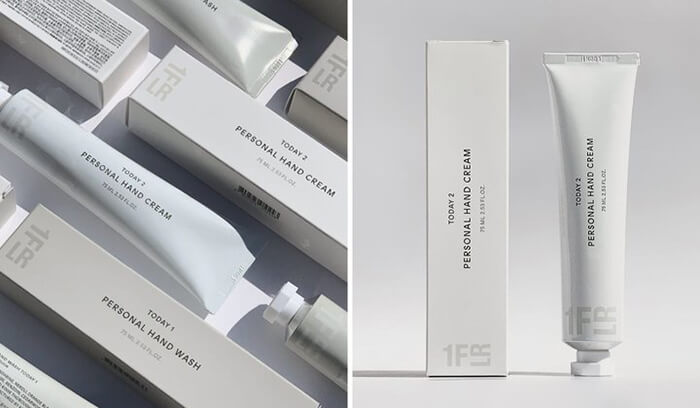
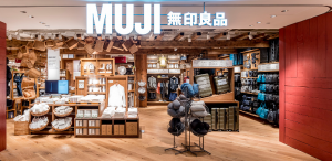
Mention packaging design. Perhaps many people will think of the modern simplicity similar to Muji, or the traditional Japanese style similar to Feng Lvfu. Of course, there are also lovely and bright styles similar to Fujika. No matter what style or field, Japanese packaging design can always make people feel relaxed and happy.
Why can Japanese packaging design gain so much popularity in the world?
1. Sense of design
In his book The Design Power of 0.2 seconds, Shiren Sasada mentioned: “The time for shoppers to see the goods before passing the shelves is only 0.2 seconds. If they want to make customers exclaim at this moment and are willing to stop, they must rely on eye-catching packaging.” Of course, eye-catching packaging does not mean colorful, dazzling, or color stacked, but has a certain sense of design So that customers can feel the beauty of the design, to attract customers.
2. Pacticability
Japanese packaging design not only focuses on the sense of design, but also on the practicality of products. This is not only shown in the modern packaging design of Japan, but also in its ancient packaging.
The father of Muji products, Tanaka Yiguang, takes “the most suitable form to show the essence of the product” as the core, and creates Muji products with simple design, simple packaging, function first, emphasizing the user’s sense of experience and the concept of environmental protection.
3. Customers first
Whether it is design sense or practicality, it deeply contains the core of Japanese packaging design – customer-first, customer-centered design, and enhanced customer product experience. For example, the yogurt without licking the yogurt cover (although such yogurt may lose its soul). Among them, the barrier-free design of Japanese food deeply reflects the spirit of being people-oriented and customer-first. The semicircular notch on the pure milk box — basically all 100% pure milk boxes of all brands are designed with a semicircular notch, while processed milk and other juice drinks are not. To avoid visually impaired people being able to distinguish between alcohol and ordinary drinks, and to avoid drinking by mistake. All canned liquor produced by Japanese distilleries has Braille at the opening, telling the visually impaired that it is an alcoholic drink.
In 1991, in order to facilitate the visually impaired people to distinguish shampoo and conditioner, Kao Company introduced a new scheme for the bottle design, which designed the sides of all shampoo bottles to be uneven, while the conditioner remained smooth.
4. Keep pace with the times and carry forward the tradition
While pursuing the freshness of the times and modern fashion style, Japanese packaging design also strives to carry forward the traditional culture and style of the nation. While Japanese packaging is divided into Heyang style and foreign style, there is also a combination of Heyang style, modern style, and traditional style. This plays a great role in deepening people’s recognition of products. After all, most people will be proud of their country and national culture.
For example, the 2017 Japanese Packaging Design Award, based on the carp flag, a representative of Japanese traditional packaging and traditional culture, adds modern color elements and modeling. It is an ingenious combination of modernity and tradition, and harmony with foreign countries.
Another example is the product design of Muji, which is based on Japanese traditional material mourning culture and Zen culture and uses modern design techniques to create modern Japanese products with Japanese local characteristics.
The packaging culture of Japan has a long history, and modern Japan combines the wisdom of the past ancestors, beautiful traditional culture, and developed modern technology, and in the spirit of a period of time, it has created a unique modern packaging design in Japan, which bursts out to impress people and gives us great visual and user enjoyment.

Top 10 Creative Cosmetic Packaging Design Ideas & illustrations 2023 | Luxury-Paper-Box.Com
10 Customs Of The Spring Festival (Lunar New Year) You Need To Know
Top 10 Best Lattafa Perfumes for Women & Men in 2024
Top 10 Best Packaging Design Software 2023 (Free & Paid)
Best Chocolate Packaging Designs of 2025
Natural Concept Perfume Design Ideas: Tell Your Brand Story


 kali@luxury-paper-box.com
